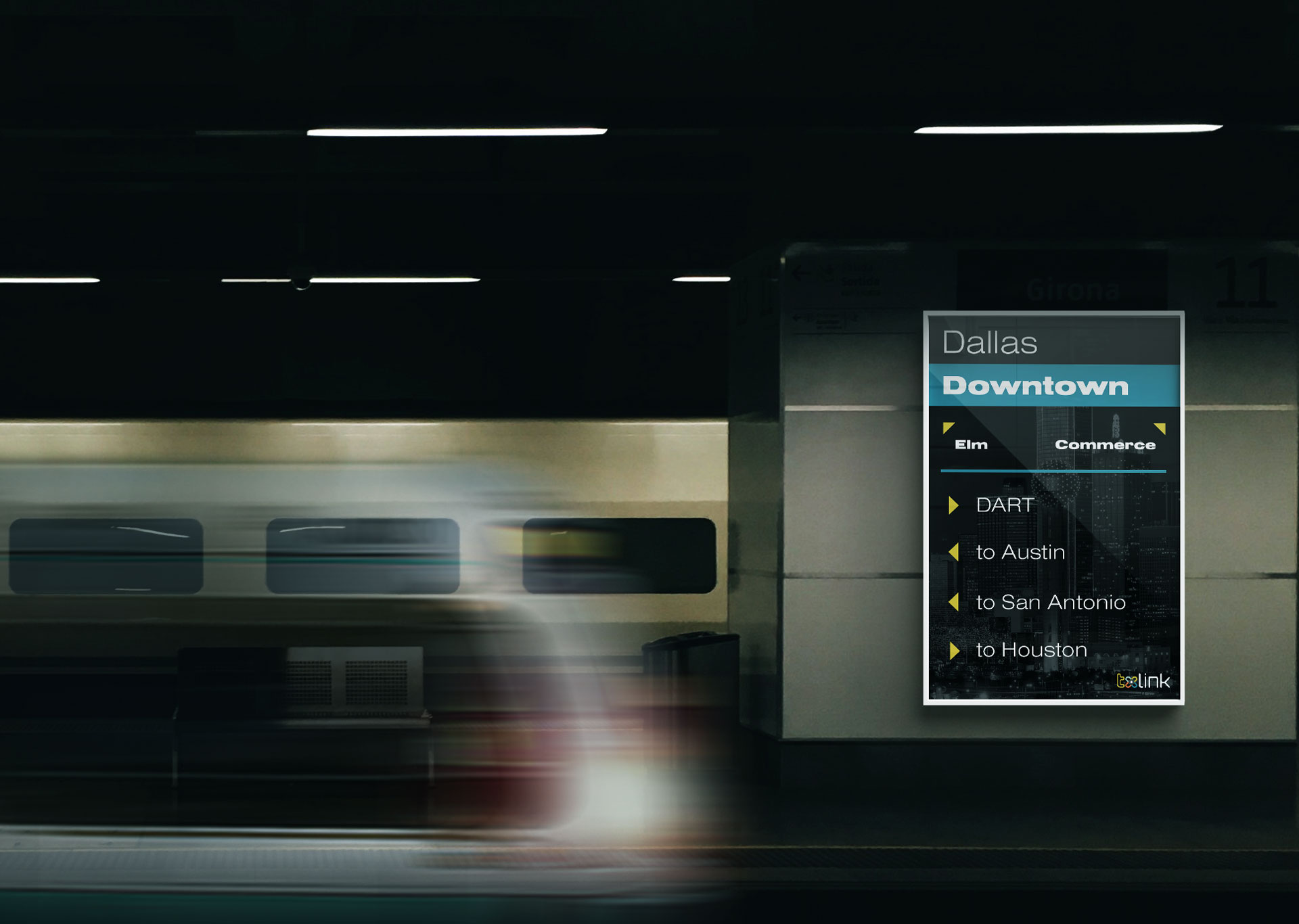
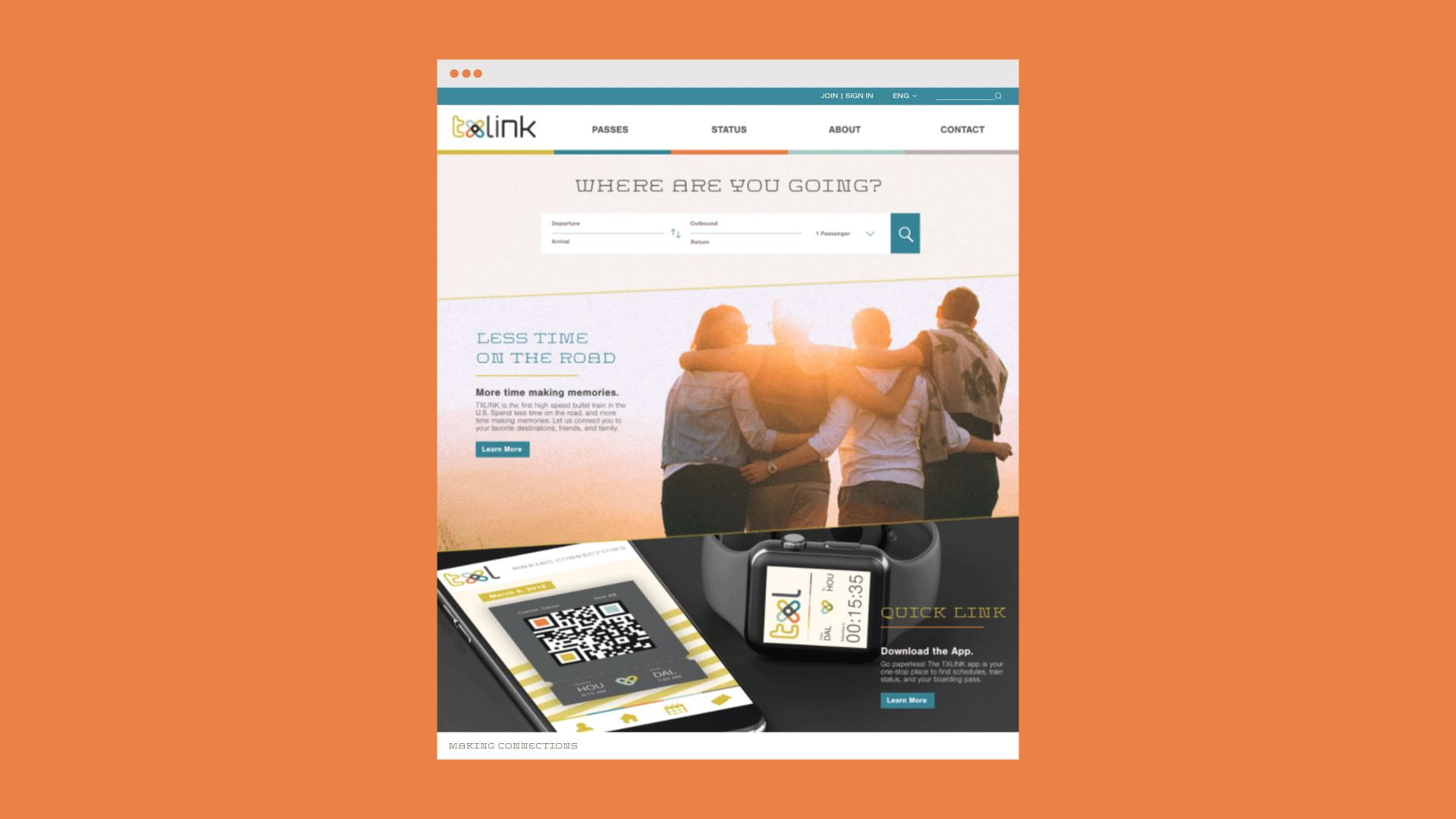
TXLINK
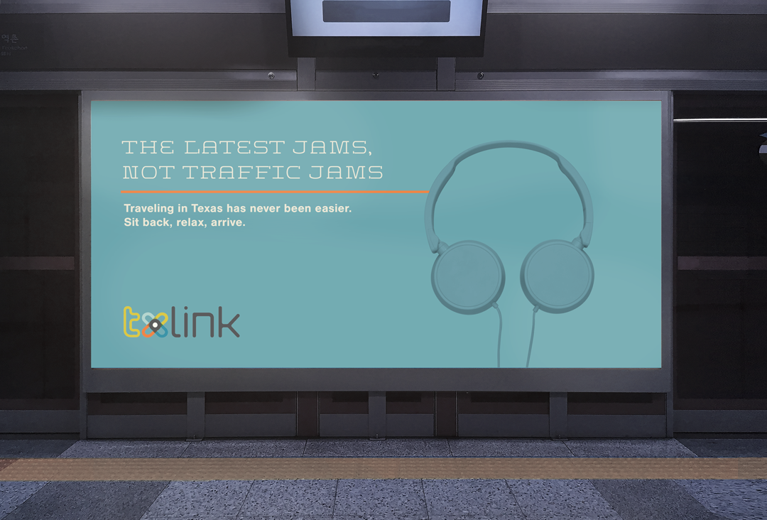
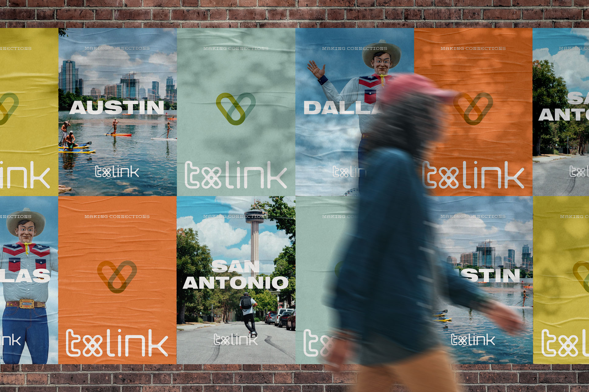
TXLINK is a bullet train concept that strives to provide first-class experience, technology, and service — along with neighborly charm. TXLINK focuses on making connections between friends, neighbors, cities, communities, and cultures with more ease, speed, & efficiency.
Scope
Branding
Web
Digital
Print
Role
Design
Art Direction
Copywriting
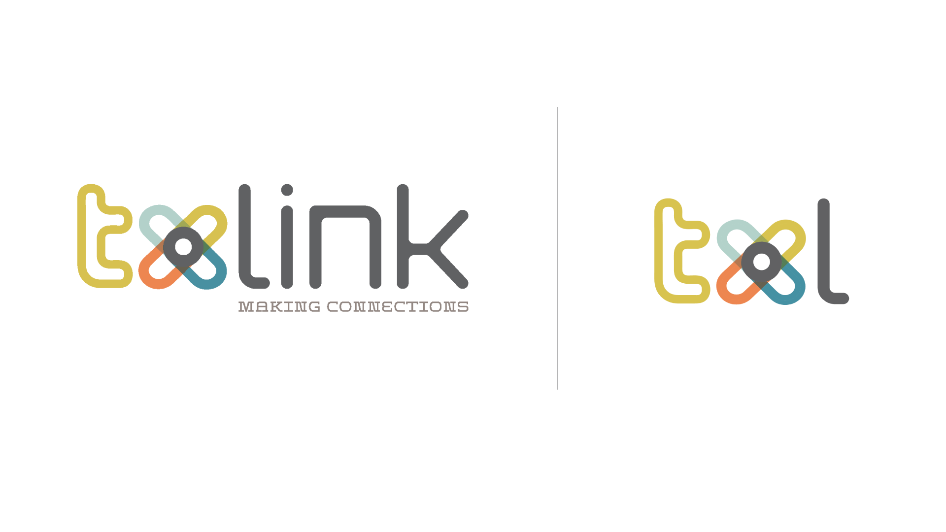
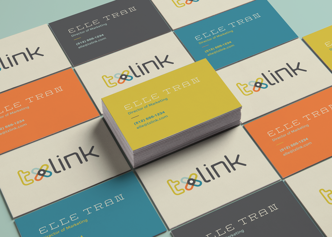
Logo
The TXLINK logo serves as an instantly recognizable element; the Linked X icon symbolizes all of the major Texas cities that the train connects: Dallas, Houston, San Antonio, and Austin. However, the train strives not only to connect cities, but neighbors, friends, families, cultures, and communities. The primary and secondary logos represent these ideas in a charming, friendly and accessible way.
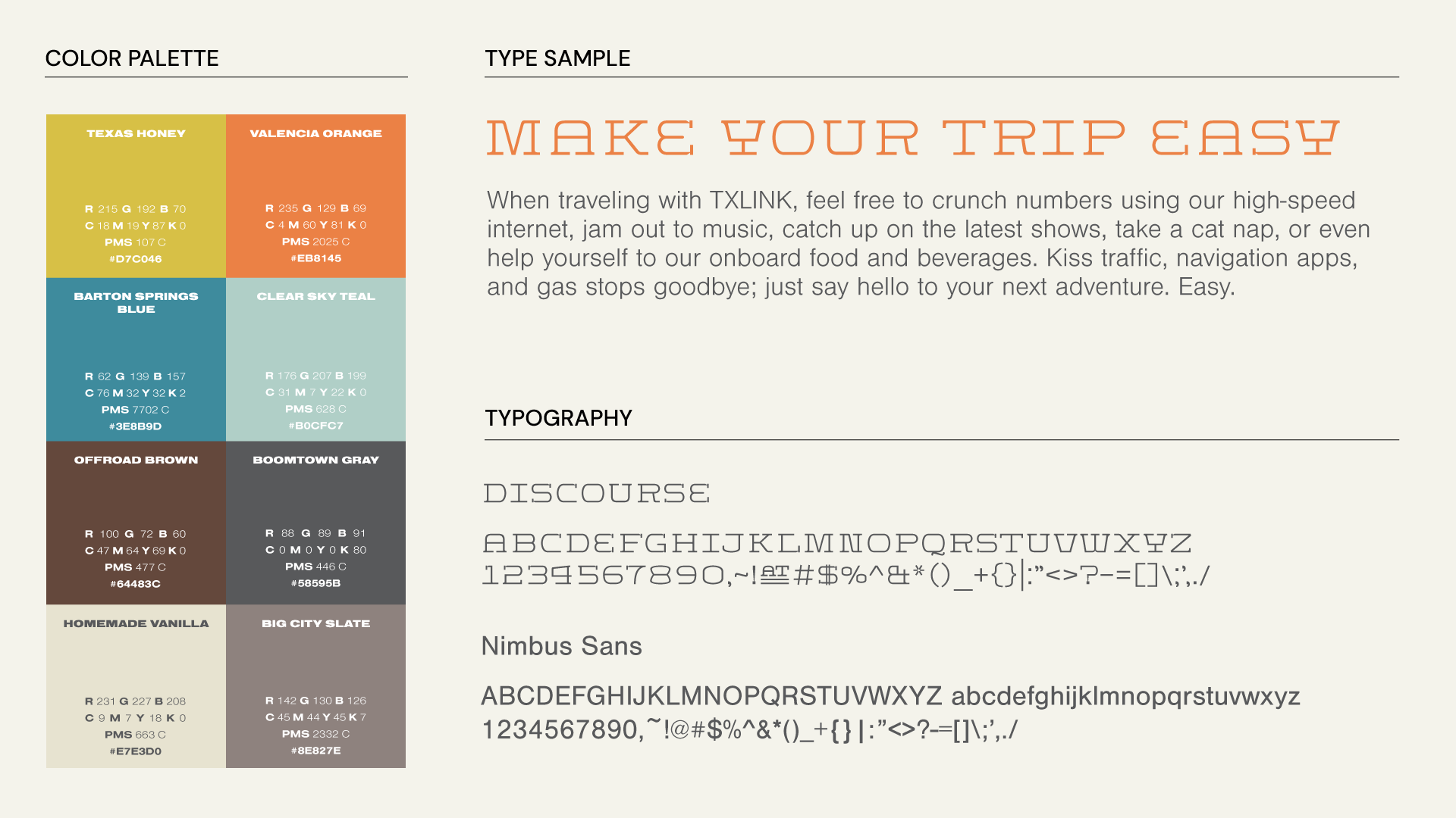
Color Palette
Beyond the logo, color is the most recognizable aspect of the TXLINK brand identity. The palette range represents bold, diverse communities and special characteristics of the state.
Type
Discourse is a display typeface used in web and print collateral; a nod to the historic, charming, friendly flair of Texas. This is reserved for short phrases and headlines. Nimbus Sans is a clean, contemporary typeface that accentuates the streamlined experience TXLINK delivers to its guests.
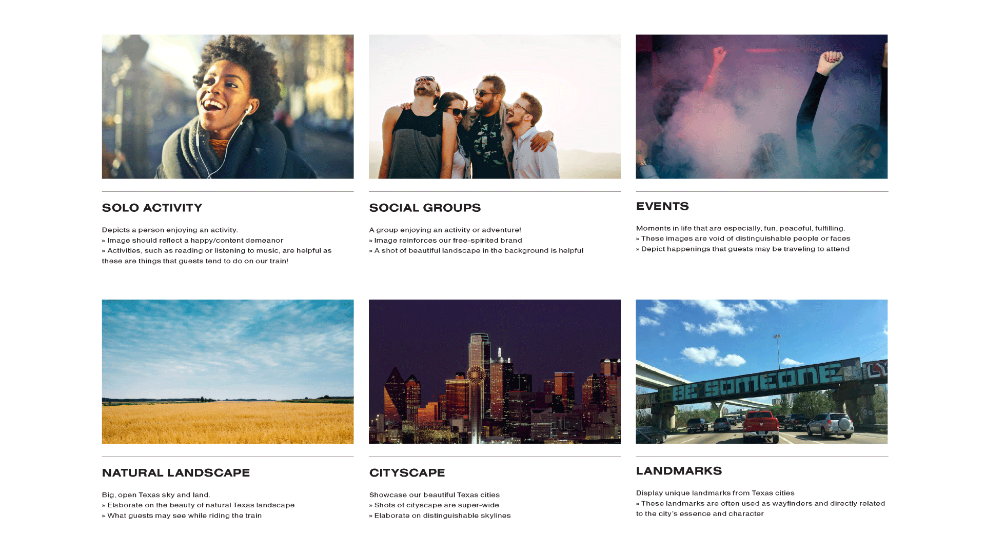
Imagery
TXLINK imagery conveys the feeling of adventure, relaxation, and fun that the train connects its guests to. With an emphasized nature of free-spiritedness, the photography also showcases a broad spectrum of representation, reflective of the diversity found in Texas.
MORE PROJECTS
CRUNCHDigital
UHGD18*Identity, Branding, Web, Print, Digital
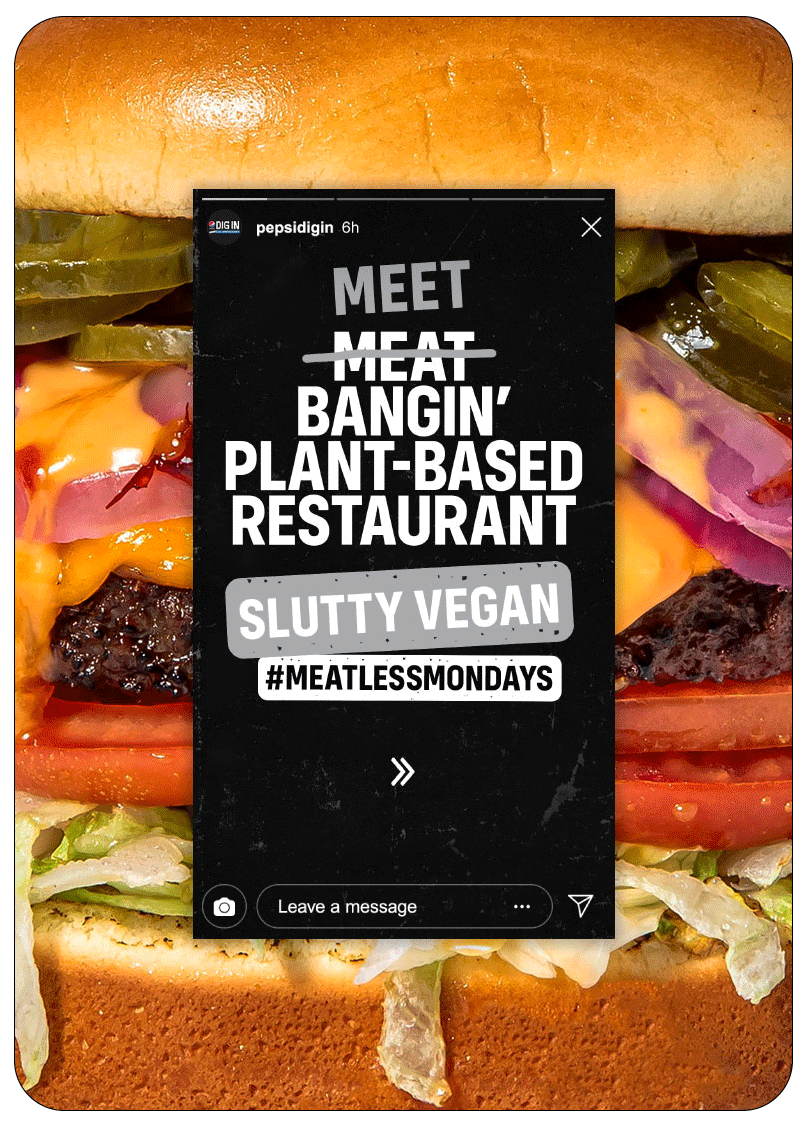
Pepsi Dig InDigital
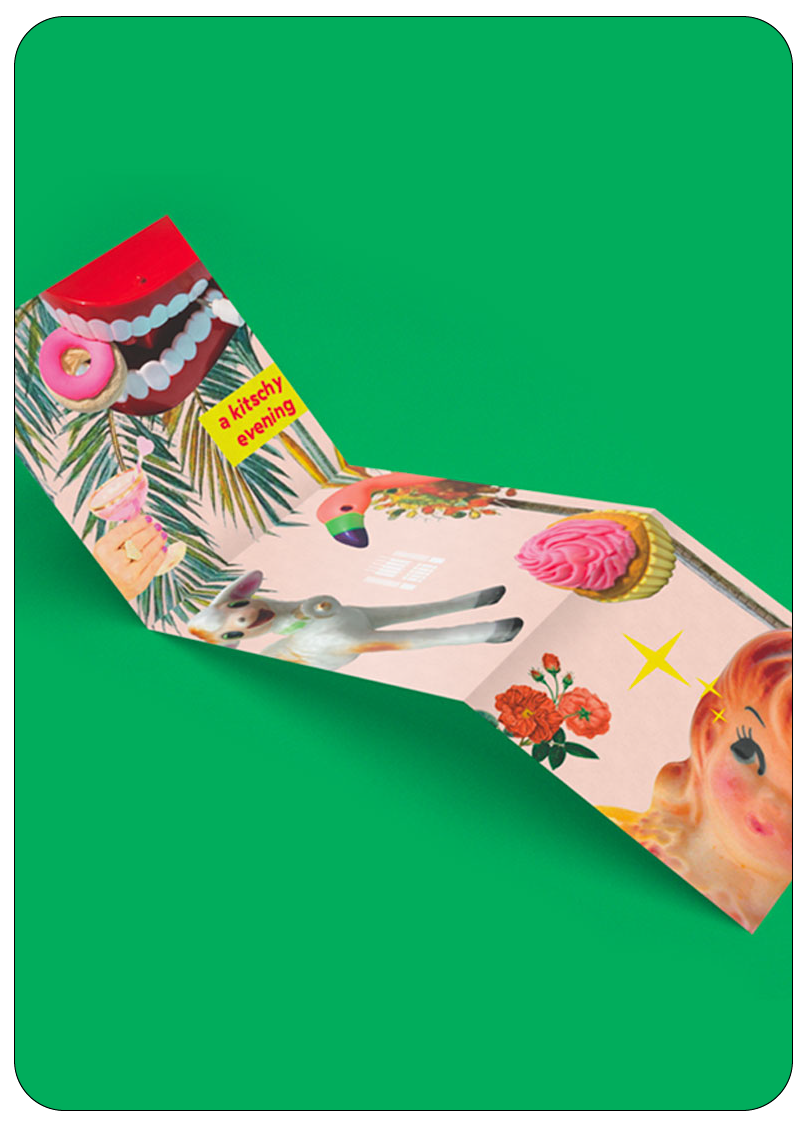
A Kitschy EveningBranding, Print, Digital
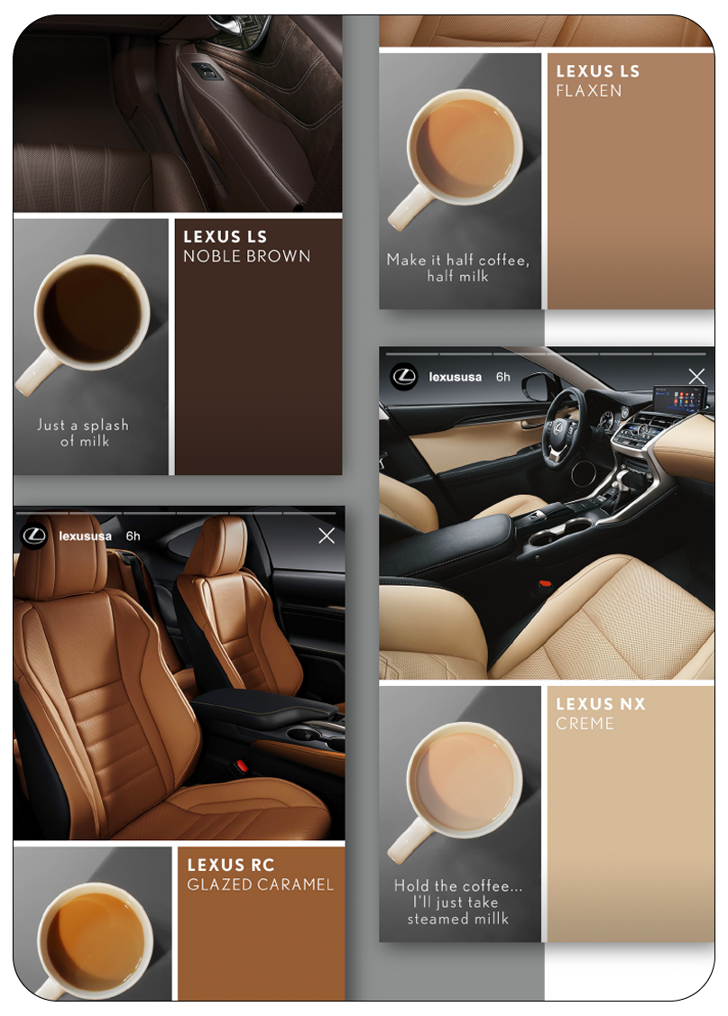
LexusDigital, Video
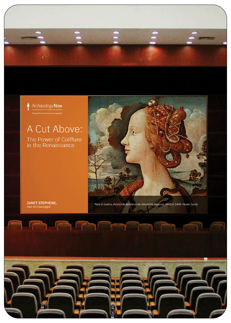
Archaeology NowBranding, Print, Web
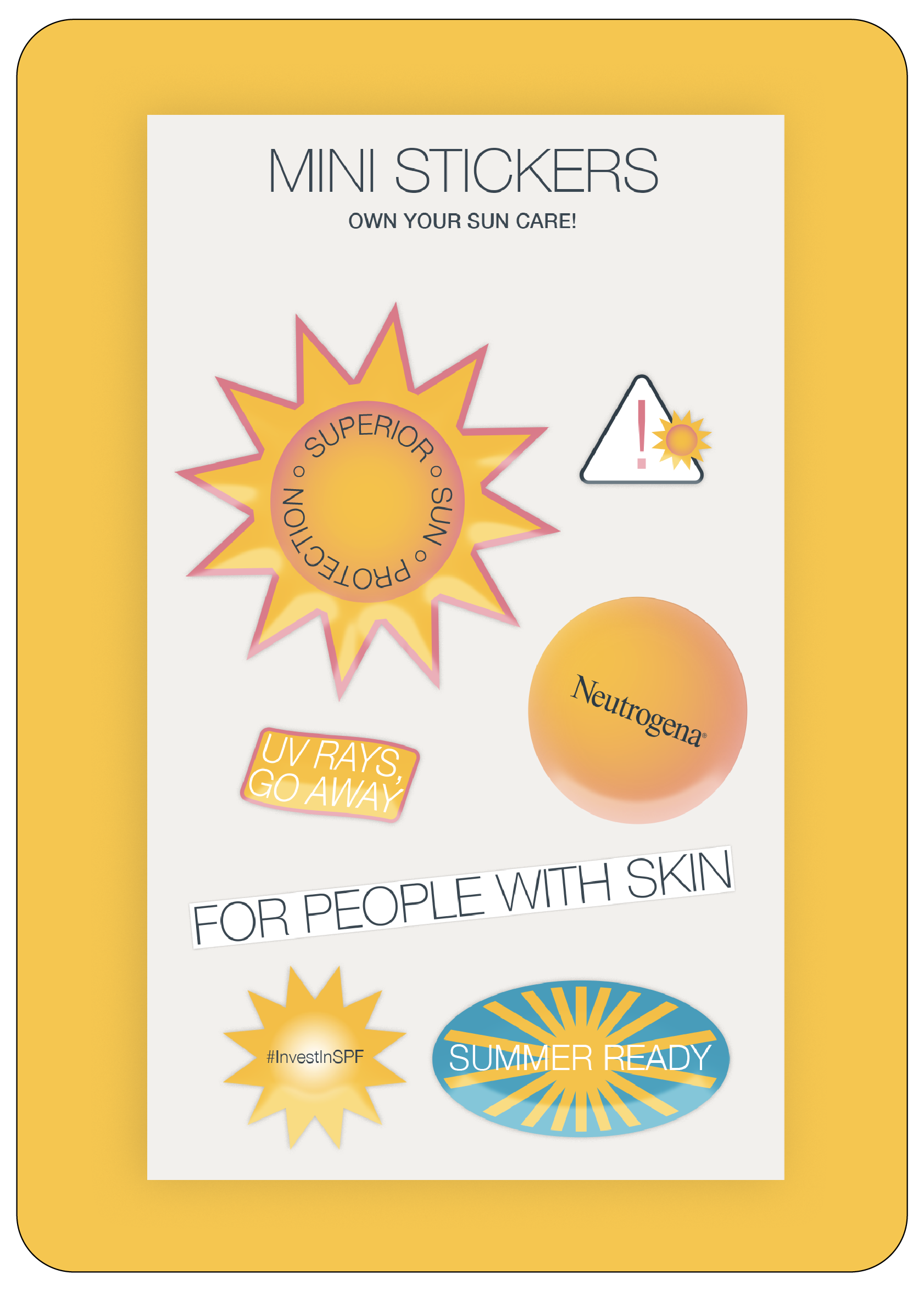
Neutrogena Sun CarePackaging, Print
EncounterEnvironmental
SkinType Design, Packaging, Print
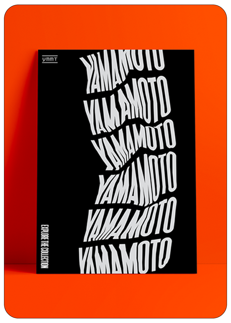
Yamamoto CollectionUX/UI, Branding, Print
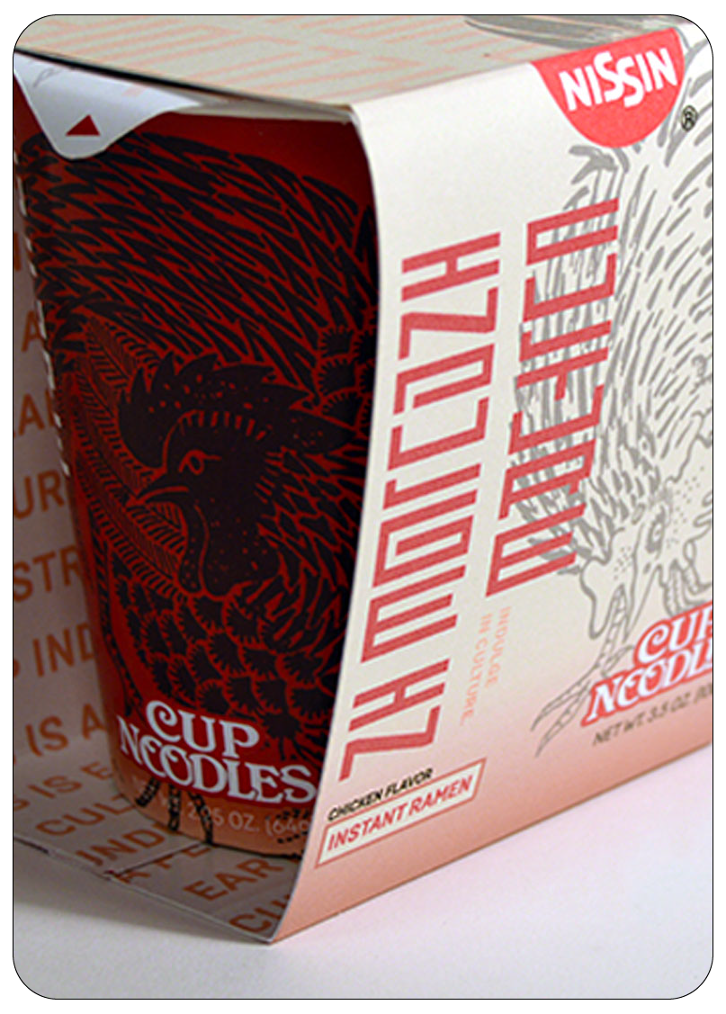
This is Earth FoodPackaging, Print


